
Cyanová is a color term associated with cyan, the vivid blue-green color between blue and green. In Slovak color descriptions, cyanová can refer to the familiar cyan shade used in digital graphics; in broader online discussions, the word is sometimes used more loosely for cyan-like tones. Standard web cyan has the HEX code #00FFFF and RGB values of 0, 255, 255. However, Cyanová is not a separate, standardized CSS color name, so the exact shade depends on the context. If you have come across the word in a palette, an article, or a design brief, the safest approach is to confirm the intended color code rather than rely on the name alone.
I’ll explain what makes it recognizable, how it behaves on screens and in print, and how to choose combinations that are attractive without sacrificing readability.
What Does Cyanová Actually Mean?
The spelling offers a useful clue. A Slovak color reference uses cyanová farba for cyan and lists #00FFFF as one corresponding value. Here, farba means “color.” The accented ending belongs to the language, not to a new color model or a patented pigment.
This matters because English-language articles can make Cyanová sound like a newly discovered shade. I would be cautious about that claim.
There is another revealing detail: the same Slovak color encyclopedia identifies #00FFFF as cyanová, while a separate entry also labels process cyan, #00B7EB, with that Slovak adjective. These references illustrate why a color name alone is not enough for precise production work.
Is Cyanová an official color name?
It is a usable color description, but not an independent keyword in the standardized list of CSS named colors. Web browsers understand cyan and aqua; they do not recognize cyanová as a built-in CSS color value.
If someone supplies a Cyanová brand identity, request its HEX or RGB specification. That one question prevents disagreements about whether they meant electric aqua, subdued turquoise, or a printing-oriented cyan.
What Color Is Cyanová, and What Does It Look Like?

Picture a bright tropical-water tone with a noticeable blue-green balance. Pure screen cyan contains full-strength green and blue light, with no red. The result looks more luminous than most teal shades and less green than many mint colors.
That description fits #00FFFF, a useful reference point rather than an official code for every Cyanová usage. Some designs use a slightly bluer or darker variation because pure cyan can look intense across a large surface.
Lighting, neighboring colors, and display settings change how the same code appears. Against black, cyan can look almost neon. Next to white, it may feel pale and lose definition at the edges.
I find it more useful to ask what a shade needs to accomplish than to argue over whether it looks “cyan enough.” A website accent, a clothing fabric, and a wall finish may all call for different versions of the same color family.
Cyanová Color Codes: HEX, RGB, HSL, and CMYK
For digital work, I use standard cyan as the starting point:
- HEX:
#00FFFF - RGB:
rgb(0, 255, 255) - HSL:
hsl(180 100% 50%) - CSS named colors:
cyanoraqua
These expressions describe the same sRGB color. HEX is convenient for copying into a design tool, RGB describes red, green, and blue channel values, and HSL describes hue, saturation, and lightness. MDN’s CSS color reference confirms that cyan and aqua are aliases for #00FFFF.
CMYK is different. Its letters stand for cyan, magenta, yellow, and black printing inks. Although pure cyan ink is sometimes expressed as C100 M0 Y0 K0, I would never promise that it will match a glowing #00FFFF screen sample exactly.
An RGB-to-CMYK conversion depends on the selected color profile, printer, ink, and paper. Adobe’s color-mode documentation explains why some saturated screen colors fall outside a printer’s reproducible range. If the final product is physical, ask the printer for a profile and approve a proof before production.
Cyanová vs. Cyan, Teal, Turquoise, and Aquamarine
These words share visual territory, but they do not always point to interchangeable colors. The table uses established CSS values as consistent reference samples, not universal definitions of every shade sold under each name.
| Color name | Reference HEX | How it usually looks | Useful application |
|---|---|---|---|
| Cyan / Aqua | #00FFFF | Bright, balanced blue-green | Digital highlights and visual effects |
| Dark cyan | #008B8B | Deeper, more restrained | Interface accents and headings |
| Teal | #008080 | Dark blue-green | Branding, furniture, and editorial layouts |
| Turquoise | #40E0D0 | Softer, often greener | Lifestyle graphics and accessories |
| Aquamarine | #7FFFD4 | Light, airy green-cyan | Backgrounds and gentle palettes |
The difference becomes clearer when these swatches sit beside one another. Teal tends to anchor a layout; cyan draws attention. Turquoise and aquamarine often feel softer, but the impression depends on surrounding colors and the exact values selected.
Why Cyanová Feels So Different from Blue or Green

Cyan sits where blue and green light overlap in the RGB model. That is why it can suggest qualities associated with both: the openness of blue and the freshness commonly associated with green.
Its strongest visual characteristic is not a fixed emotion; it is the relationship between brightness, saturation, and context. Highly saturated cyan beside charcoal looks energetic. A muted version beside sand or warm white feels calmer.
Color psychology can help with a creative direction, but it is not a reliable way to predict everyone’s response. Culture, personal associations, accessibility needs, and the design around a color all influence interpretation.
I would describe cyan as potentially fresh, clear, aquatic, or technological, rather than claiming it automatically makes viewers feel peaceful or trust a brand. A thoughtful design supports its message with language, imagery, spacing, and usability—not color alone.
Where Cyanová Works Best
1. Websites, Apps, and Product Interfaces
A cyan accent can signal links, interactive controls, selected tabs, or status information. It works especially well alongside deep navy, slate, or charcoal, where the lighter color is easy to notice.
The common mistake is using bright cyan everywhere. If headers, buttons, icons, and backgrounds all compete at full intensity, the interface becomes tiring to scan. I prefer one clear accent role and a quieter supporting palette.
Also, never depend on color alone to communicate an error or success state. Pair the hue with text, an icon, or another visible cue so users can understand the message without distinguishing every shade.
2. Logos, Packaging, and Visual Identities
Cyan can suit brands that want a crisp, contemporary appearance, including technology products, water-related services, and creative businesses. It is not automatically appropriate for those industries; the brand’s personality still comes first.
Before approving a logo, I would check it on white, dark, photographic, and printed backgrounds. I would also confirm that the smallest version remains recognizable.
3. Photography, Illustration, and Video
Cyan can emphasize water, glass, futuristic lighting, or a cool atmospheric mood. In digital illustration, it also contrasts strongly with warm oranges and reds, creating striking focal points.
However, heavy cyan color grading can make skin tones, shadows, and neutral surfaces look unnatural. I would apply it selectively, then compare the edited image with the original to make sure important details still feel believable.
4. Fashion and Accessories
A cyan handbag, scarf, sneaker, or jacket can create a strong focal point without requiring an entirely bright outfit. Navy, white, charcoal, and beige are useful companions because they give the color room to stand out.
Fabric introduces variables that a screen swatch cannot capture. Satin reflects light, cotton absorbs it, and textured knitwear may make an identical dye look deeper. When matching garments, compare physical samples in natural and indoor light.
5. Interiors and Home Décor
In a room, cyan works well as a controlled accent: a cushion, ceramic vase, upholstered chair, or section of tile. Used near pale timber, warm neutrals, and natural textures, it can suggest coastal freshness without making a room feel themed.
I would test a large paint sample before covering a wall. Daylight, artificial bulbs, surface finish, and nearby materials can shift the appearance dramatically. A small sample on a phone is not a dependable substitute.
What Colors Go Best with Cyanová?
There is no single perfect partner. The right combination depends on whether you want clarity, softness, or drama. These pairings are suggestions for exploration, not certified accessible text combinations.
| Companion color | Example HEX | Effect with cyan | Good starting point |
|---|---|---|---|
| Deep navy | #102A43 | Crisp, focused contrast | Dashboards and technology branding |
| Warm off-white | #F8F5EF | Airy and relaxed | Interiors and editorial layouts |
| Charcoal | #263238 | Bold, contemporary | Posters and product graphics |
| Soft coral | #FF7F70 | Energetic warm-cool contrast | Illustrations and campaign accents |
For a calm result, use plenty of neutral space and let cyan occupy a smaller area. For an energetic design, introduce a warm accent such as coral but avoid making both colors equally dominant.
I also recommend checking each combination in grayscale. If everything turns into a similar shade of gray, users may struggle to identify the hierarchy even when the full-color version looks attractive.
A Small Cyanová Palette Test I Ran for This Article
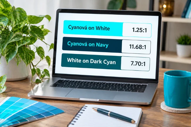
Rather than relying on adjectives such as “readable” or “striking,” I calculated contrast ratios for several actual color pairs using the WCAG relative-luminance formula. The exercise revealed a useful trap: pure cyan on white has a contrast ratio of only about 1.25:1.
That is far below the 4.5:1 minimum for ordinary text at WCAG AA. The same cyan against deep navy (#102A43) reaches approximately 11.68:1, an enormous improvement without changing the accent color.
I also checked white text on a darker blue-green (#0D5C63). That pairing reaches approximately 7.70:1, showing why a darker cyan-family color can be more practical for buttons and labels than electric cyan.
These are calculated results for opaque, solid colors—not measurements from every real screen. Gradients, transparency, imagery, and text placement require separate checks. The lesson is simple: choose a cyan based on its job, then verify the exact pairing rather than trusting your eyes alone.
How to Use Cyanová Without Accessibility Problems
A visually impressive palette is not automatically an inclusive one. WCAG 2.2 specifies a minimum text contrast ratio of 4.5:1 for most normal-sized text and 3:1 for qualifying large text at Level AA.
I follow three practical rules. First, I check foreground and background colors together instead of evaluating isolated swatches. Second, I avoid placing thin white text on bright cyan. Third, I retain visible labels, underlines, or icons when color communicates meaning.
Clickable controls also need recognizable states for hover, keyboard focus, and disabled conditions. If a cyan border is the only sign that a field is selected, the experience may become confusing for people with low vision or color-vision differences.
Common Mistakes to Avoid with Cyanová
The first mistake is assuming every use of Cyanová means #00FFFF. That value is a dependable web-cyan reference, not an official universal definition for the accented term. If a client supplies only the word, ask for a swatch or numerical value.
The second is copying screen codes directly into a print specification and expecting an identical result. Confirm the paper stock, output profile, and proof instead. Bright display colors can be particularly difficult to reproduce using ordinary process inks.
Another mistake is confusing attention with clarity. An entirely cyan interface can be memorable for a moment but frustrating to read. Strong hierarchy usually comes from a balance of contrast, spacing, type size, and selective color use.
Finally, avoid presenting color psychology as established fact about every audience. A blue-green background cannot, by itself, make a product trustworthy, a bedroom relaxing, or a logo modern. Those outcomes depend on the complete experience.
How I Would Choose the Right Cyanová Shade
I start with the final medium. For a website, I choose an sRGB HEX value, define its role, and check contrast. For printed packaging, I discuss color profiles and proofing with the supplier. For an interior, I rely on physical samples viewed in the actual room.
Then I decide how much attention the color should receive. Pure cyan works as a small, energetic highlight. A darker teal-like version is often easier to use for dense interfaces, while a pale aquamarine can provide a quieter background.
Most importantly, I save the selected codes in a simple style guide. Names are useful for conversation; specifications are what keep the final result consistent across designers, devices, and materials.
Final Thoughts
Cyanová is best understood as a cyan-related color term whose exact meaning depends on language and context. Standard web cyan gives you a reliable starting reference, but successful use requires more than finding a bright HEX code.
Choose the version that suits your project, test it against its surroundings, and document the exact values. If you are planning a design now, start with one cyan accent and two neutral colors, then check whether the combination still works for readability, printing, and everyday use.
Frequently Asked Questions
What does Cyanová mean in English?
It generally refers to cyan or a cyan-colored shade. In Slovak, cyanová is used in color descriptions such as cyanová farba.
Is Cyanová the same as cyan?
Often, yes, in ordinary color descriptions, but Cyanová is not an independent standardized CSS color keyword. Ask for a code when precision matters.
What is the HEX code for Cyanová?
Standard digital cyan is #00FFFF, but not every color described as Cyanová uses that exact value.
What colors look good with Cyanová?
Navy, charcoal, warm white, beige, and carefully chosen coral accents can work well. Check each combination for readable contrast.
Can I use Cyanová as a CSS color name?
Not directly. Use cyan, aqua, or a valid color value such as #00FFFF instead.

Noah Sterling is a technology research writer with 8+ years of experience covering emerging technologies, software trends, digital tools, and innovation. He creates practical, research-based articles to help readers understand the evolving technology landscape.