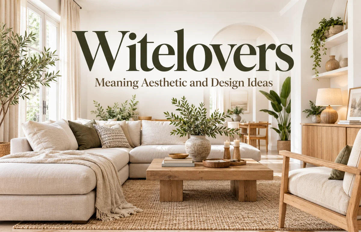
Witelovers is an informal online term most commonly associated with clean, bright, organized spaces, neutral colors, minimalist design, and intentional living. It is not an officially recognized interior-design movement, and there is no verified founder or universal set of Witelovers rules.
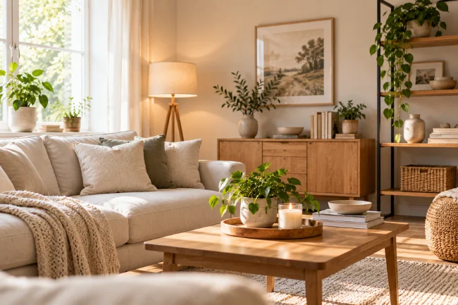
In practical terms, the Witelovers aesthetic favors visual simplicity: think white, cream, beige, soft gray, natural wood, uncluttered rooms, useful furniture, natural light, and carefully chosen décor. The idea can also extend beyond the home into fashion, photography, workspaces, and everyday organization.
I found one detail particularly important while researching the term: different websites do not always use Witelovers in exactly the same way. That means it is better understood as an evolving internet label than as a historical design school with a fixed definition.
What Does Witelovers Mean?
The simplest Witelovers meaning is an appreciation for clean, light, organized, and visually calm surroundings.
Most lifestyle interpretations connect the term with minimalist interiors and neutral aesthetics. A Witelovers-inspired room may have pale walls, uncluttered surfaces, functional furniture, natural textures, and fewer decorative objects competing for attention.
But I would not define Witelovers as “a love of white things” alone.
White may be prominent, yet the broader idea is usually about creating visual breathing room. Cream, beige, warm gray, muted brown, natural wood, black accents, plants, linen, stone, and other subtle materials can all work within the same aesthetic.
Several current explanations also extend the term into clothing, photography, digital organization, and simple living. Because no recognized authority controls the definition, its exact meaning can shift depending on where you encounter it.
Does Witelovers Mean “White Lovers”?
Possibly, but this should not be presented as established fact.
Some online sources interpret the spelling as a stylized variation related to “white lovers” or “whitelovers.” The connection makes intuitive sense because white and light neutral shades feature heavily in the aesthetic.
However, I could not find reliable documentation identifying who created the word or proving that “white lovers” is its original etymology. Current sources themselves acknowledge that the origin is uncertain.
So, if I were explaining it accurately, I would say that “white lovers” is one possible interpretation of the name, not a confirmed definition.
Where Did Witelovers Come From?
There is no reliably documented founder, launch date, original community, or formal organization behind Witelovers.
That matters because internet terms often acquire elaborate backstories after they start appearing in search results. Repetition can make an explanation seem established even when nobody has produced a primary source.
While researching Witelovers, I found plenty of recent lifestyle articles describing the concept, but not an authoritative early record that establishes exactly when or where it began.
The safest conclusion is that Witelovers is an internet-era expression whose current lifestyle meaning is easier to identify than its historical origin.
Its popularity also makes sense in the context of much older trends. Minimalist interiors, Scandinavian design, Japandi, neutral palettes, natural materials, decluttering, and intentional purchasing were already well established before Witelovers started appearing as a label.
Architectural Digest, for example, describes minimalist interiors through ideas such as intentionality, functionality, clean lines, limited furnishings, and purposeful décor. Scandinavian interiors similarly emphasize functionality, natural materials, neutral colors, clean lines, texture, and natural light.
Witelovers appears to borrow heavily from that existing design vocabulary.
Witelovers vs. Minimalism, Scandinavian Design, and Japandi
Calling Witelovers “minimalism with white walls” misses several useful distinctions.
Here is how I would separate the concepts.
Minimalism does not require an all-white home. Its deeper principle is intentional reduction: keeping what serves a purpose or has genuine value.
Scandinavian design gives greater attention to comfort, craftsmanship, light woods, texture, and natural light. Japandi combines Scandinavian qualities with Japanese-influenced simplicity, organic materials, restrained decoration, and appreciation for craftsmanship.
Witelovers is looser. I see it as a descriptive aesthetic label that can borrow from all three without requiring someone to follow an established philosophy.
What Does the Witelovers Aesthetic Actually Look Like?
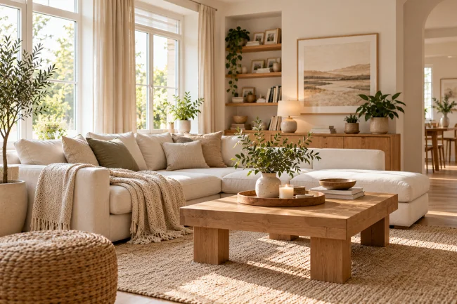
A useful Witelovers space should feel considered rather than empty.
The easiest mistake is assuming that painting everything white automatically creates the look. It does not.
A successful neutral room relies on relationships between color, texture, light, furniture, and negative space.
A Soft Neutral Color Palette
White may form the background, but layering similar tones generally produces a more livable result.
Useful shades include:
- Warm white
- Ivory
- Cream
- Beige
- Taupe
- Soft gray
- Light brown
- Natural timber tones
Undertones matter more than many people expect. Designers commonly distinguish between warm and cool neutrals because combining incompatible undertones can make a room feel visually disconnected.
If the flooring and furniture lean warm, I would normally build around warm whites, creams, tan, and wood instead of adding an icy blue-white simply because it looks “minimal.”
Texture Instead of Excess Decoration
When a room contains fewer strong colors, texture carries more visual weight.
Linen curtains, woven baskets, wool rugs, ceramic objects, textured cushions, timber, stone, cotton, and plants can stop a pale interior from looking flat.
Professional designers use the same principle in neutral interiors: material variation and texture provide depth when color is deliberately restrained.
This is one area where I think many simplified Witelovers explanations fall short. A clean aesthetic should not mean removing every interesting surface.
Natural and Layered Lighting
Large amounts of daylight naturally complement white and neutral rooms.
But natural light should not be treated as a requirement. Not everyone has floor-to-ceiling windows or a perfectly positioned apartment.
In a darker room, layered lighting can create a similar sense of openness. Instead of relying on one harsh ceiling fixture, combine ambient lighting with lamps or task lighting where practical.
The goal is visual clarity, not copying an unrealistic social-media photograph.
Functional Furniture
Furniture should earn its place.
That does not mean every object needs hidden storage or a minimalist designer label. It simply means the room should work for the people living in it.
A comfortable sofa, practical table, accessible shelving, useful desk, or well-positioned lamp contributes more to the Witelovers approach than decorative purchases made only because they match a beige mood board.
A Practical Witelovers Framework I Use
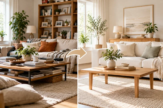
Because there is no official Witelovers rulebook, I find it more useful to evaluate a room through four questions.
1. Is It Visually Clear?
Look at the major surfaces first.
If every table, shelf, countertop, and wall competes for attention, reducing visible clutter can create a bigger change than purchasing new furniture.
Clear does not mean empty. Books, family photographs, art, collections, and meaningful possessions can remain.
The goal is hierarchy: some objects deserve attention while others simply need a sensible home.
2. Does Everything Work for Real Life?
A beautiful white sofa that nobody feels comfortable sitting on is not good design.
Neither is a kitchen that photographs perfectly but has nowhere convenient to store everyday appliances.
For me, this is the line between useful simplicity and performative minimalism. A Witelovers-inspired room should make daily life easier, not force daily life to accommodate the aesthetic.
3. Is There Enough Warmth?
This is where wood, linen, plants, rugs, ceramics, woven materials, books, and personal objects become valuable.
Minimal-color interiors can look sophisticated, but professional designers repeatedly emphasize variation in materials, undertones, and texture to avoid lifeless rooms.
If a room looks sterile, I would add warmth before adding more white.
4. Am I Simplifying or Just Shopping?
This is the question I rarely see discussed in articles about aesthetic minimalism.
If someone replaces ten perfectly usable possessions with ten beige versions of the same possessions, the room may look more cohesive, but nothing meaningful has been simplified.
A stronger interpretation of Witelovers is to work with what you already own first. Rearrange, declutter, repair, repaint, organize, or repurpose before treating the aesthetic as another reason to consume.
How to Create a Witelovers-Inspired Home
You do not need a renovation or a large decorating budget.
Start with visibility. Clear one busy surface, remove objects you no longer use, and give frequently used items a defined storage location.
Next, identify the dominant colors already present in your home. Rather than replacing everything, build around your existing flooring, furniture, curtains, or cabinetry.
Then improve visual consistency through smaller decisions.
The principle is simple: subtract confusion before adding decoration.
Is Witelovers Expensive?
It does not have to be.
In fact, buying large quantities of new décor contradicts the most useful part of the concept.
Some of the greatest changes cost nothing: repositioning furniture, clearing countertops, grouping similar objects, opening curtains, removing unused items, simplifying shelves, or moving visual clutter into appropriate storage.
If you do buy something, prioritize usefulness and longevity.
One durable lamp that solves a lighting problem has more value than several decorative accessories purchased only to make a room look more “Witelovers.”
Witelovers Beyond Interior Design
The term is increasingly applied beyond home décor, although these uses are less standardized. Current articles connect it with neutral fashion, clean photography, organized digital spaces, workspaces, and simple daily routines.
Fashion
In clothing, the aesthetic can translate into versatile pieces, restrained colors, straightforward silhouettes, and outfits that are easy to combine.
You do not need an entirely beige wardrobe.
The more useful principle is coordination: fewer pieces that work together can be easier to wear than a wardrobe full of unrelated trend purchases.
Photography and Social Media
In visual content, Witelovers usually means uncluttered compositions, restrained backgrounds, natural or soft lighting, and consistent colors.
That works well for product photography, lifestyle content, interiors, or personal branding because the subject remains easy to identify.
Digital Organization
A digital interpretation can be surprisingly practical.
Instead of obsessing over matching app icons, I would focus on reducing actual friction: remove unused apps, create understandable folders, clean up downloads, simplify notifications, and establish a consistent file-naming system.
That takes the idea from appearance into usefulness.
Benefits and Limitations of the Witelovers Lifestyle
The strongest benefit is flexibility.
You can adopt the parts that make your home clearer and easier to maintain without committing to strict minimalism.
Reducing visual clutter may also make cleaning and organization simpler simply because fewer exposed objects need to be moved, dusted, sorted, or searched through.
Neutral palettes are adaptable as well. Furniture, artwork, textiles, plants, and seasonal pieces can stand out against a quieter background.
There are limitations, though.
White fabrics and light surfaces may show dirt quickly. Extremely restrained interiors can feel cold. Constantly chasing an idealized social-media aesthetic can also turn simplicity into another form of consumer pressure.
The term itself remains vague, which is another limitation. If someone tells you they follow the Witelovers lifestyle, you cannot assume that their definition matches yours.
Common Witelovers Mistakes to Avoid
The first mistake is making everything white.
Variation creates depth. Wood, charcoal, muted green, stone, brown, black accents, metallic finishes, and natural fibers can strengthen a light interior instead of ruining it.
The second is removing personality.
A home should still reveal something about the people living there. Photographs, books, artwork, souvenirs, handmade objects, and inherited pieces do not automatically create clutter.
Another mistake is confusing organization with concealment. Stuffing an overflowing drawer so the countertop looks empty solves the photograph, not the problem.
Finally, avoid buying products purely to perform minimalism.
If an aesthetic built around simplicity continually requires new purchases, it deserves a second look.
Is Witelovers a Real Trend or Just an Internet Keyword?
At the moment, I would call it an emerging internet label rather than an established design movement.
Current search results repeatedly associate Witelovers with neutral interiors, organization, minimalism, bright spaces, intentional living, and related lifestyle ideas. At the same time, sources disagree about its precise origin and occasionally use the term in other contexts.
That distinction protects readers from a common problem with new online terminology: turning repetition into history.
The aesthetic ideas themselves are not new. Clean lines, neutral colors, natural light, functional design, and intentional furnishing have deep connections with established minimalist and Scandinavian interiors.
What is newer is the Witelovers label being applied to them.
My Take on Witelovers
The most useful way to approach Witelovers is not as a rulebook but as a filter.
Ask whether your space is easy to use, visually coherent, comfortable, and filled mainly with things that serve you or matter to you.
If white walls help, use them. If warmer beige works better, choose beige. If colorful artwork makes a neutral room feel like your home, keep the artwork.
That flexibility is what makes the concept more practical than chasing a perfectly staged minimalist interior.
And until stronger historical evidence appears, I would remain cautious about anyone claiming to know the definitive inventor, launch date, or official philosophy behind Witelovers.
FAQs About Witelovers
What does Witelovers mean?
Witelovers generally refers to a clean, bright, neutral, and organized aesthetic associated with minimalism and simple living, although no single official definition exists.
Is Witelovers the same as minimalism?
No. The two overlap, but minimalism is an established broader philosophy and design approach, while Witelovers is a looser online label with a stronger association with light, neutral aesthetics.
Does a Witelovers home have to be completely white?
No. Cream, beige, gray, natural wood, muted colors, plants, textured fabrics, and darker accents can all work while maintaining a clean visual style.
Who created Witelovers?
No reliably documented founder or original creator has been established. Current online sources offer interpretations, but the exact origin remains unclear.
Is Witelovers only about interior design?
No. The term is also used in discussions of fashion, photography, organization, workspaces, digital aesthetics, and simple daily routines.
Final Takeaway
Witelovers is best understood as a flexible modern aesthetic built around clarity, neutral design, organization, useful objects, and visual calm—not as a formal movement with fixed rules.
If you want to try it, begin with what you already have. Clear one overloaded area, improve its organization, keep the objects that genuinely matter, and introduce texture or natural materials where the space feels flat.
Your home does not need to look like somebody else’s mood board. The most successful Witelovers-inspired space is one that looks calmer while still functioning unmistakably as your own.

Olivia Parker is a home improvement research writer with 8+ years of experience covering home design, renovation ideas, maintenance tips, and practical living solutions. She creates easy-to-follow content to help readers make informed decisions about improving their homes.