

The Ultimate Social Media Design Checklist for 2026 (Specs, Sizes & Best Practices)
In today’s fast-paced digital ecosystem, visual content dominates consumer attention. With social media algorithms prioritizing high-engagement visuals and vertical video formats, standard graphic templates no longer yield results. Whether you are a freelance designer, an agency strategist, or a small business owner, maintaining high visual quality and technical precision is essential for stopping the scroll and driving meaningful conversions.
📌 Key Takeaways (2026 Quick Summary)
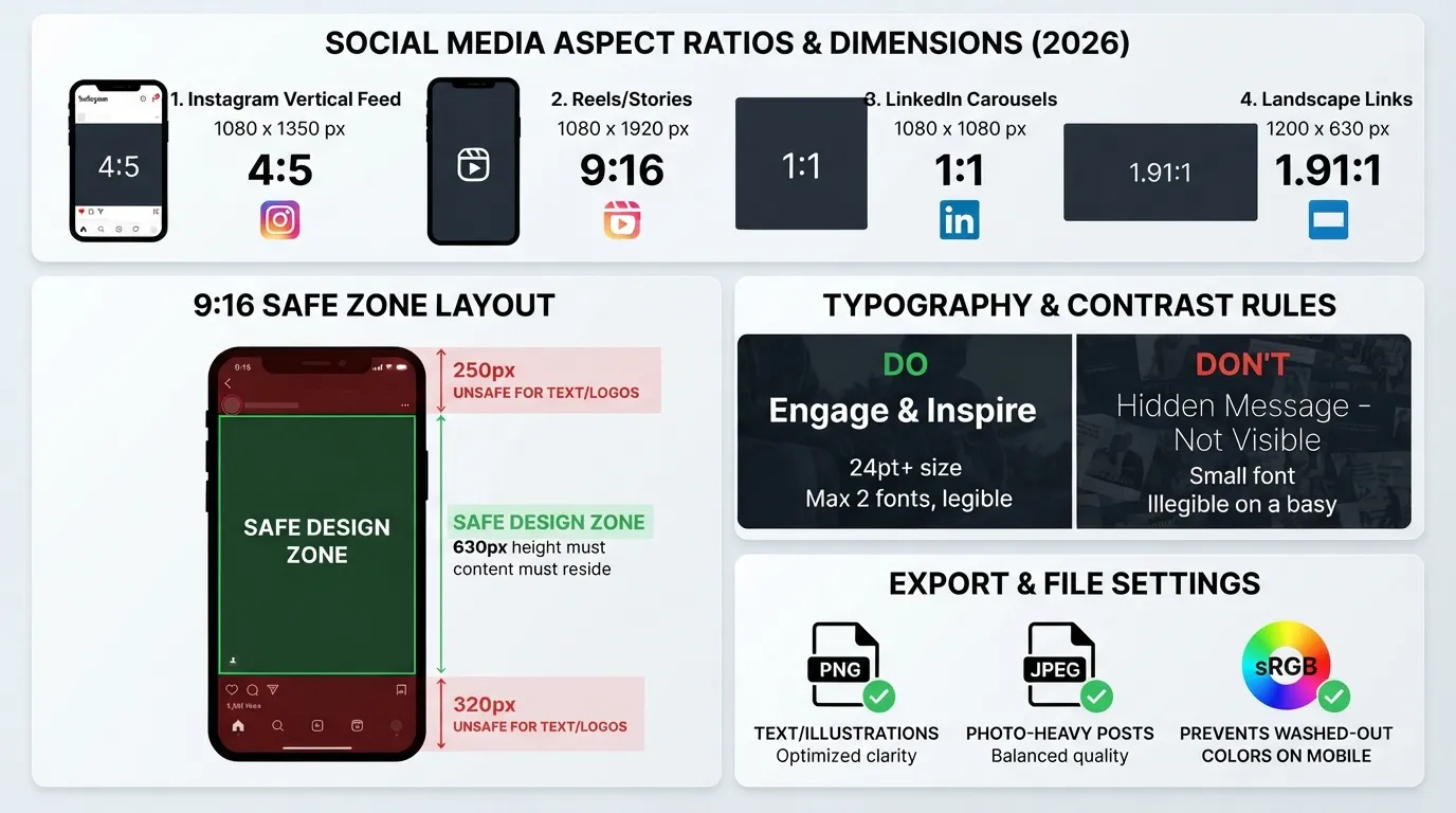
Mobile-First Ratio: Over 80% of social media consumption happens on mobile devices; always prioritize portrait aspect ratios (4:5 for feed posts, 9:16 for Stories & Reels).
Compression Defense: Export designs as PNG for text-heavy graphics and high-quality JPEG for photography to prevent blurry platform compression.
Safe Zones Matter: Keep text and essential design elements inside platform safe zones to avoid overlapping UI buttons and caption overlays.
Visual Hierarchy: Focus on one clear focal point, limit typography to two fonts, and ensure high contrast for optimal readability.
Why Social Media Design Matters More Than Ever in 2026
Social media feeds are more crowded than ever. Users decide whether to stay on your post or keep scrolling within 1.5 seconds. This makes visual appeal and instant brand recognition your primary line of communication.
High-quality social media design is not just about making things look aesthetically pleasing; it directly impacts user trust and conversion rates. A well-structured graphic conveys professionalism and clarity, whereas poorly formatted visuals immediately degrade brand value.
The Cost of Common Technical Design Errors
Failing to follow platform specifications and design standards leads to recurring issues that destroy content performance:
Blurry & Pixelated Visuals: Platforms automatically apply heavy compression algorithms when uploaded files do not match recommended pixel dimensions.
Cropped Text & Off-Center Logos: When aspect ratios are incorrect, key information gets cut off in feed previews or obscured by native app buttons (like Instagram’s share button or TikTok’s side menu).
Low Contrast & Readability Issues: Thin typography or poor color pairings render text completely unreadable on mobile screens, forcing users to scroll past.
By following a standardized Social Media Design Checklist, creators can eliminate technical errors, maintain brand consistency across all platforms, and ensure maximum visual performance.
The 7-Point Social Media Design Checklist Every Creator Needs
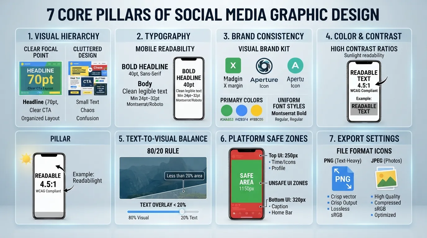
To consistently produce scroll-stopping graphics that convert, following a structured design framework is essential. Here is the definitive 7-point design checklist tailored for modern social media platforms.
1. Visual Hierarchy & Focal Point
Visual hierarchy guides the viewer’s eye through your design in order of importance. Without a primary focal point, users get overwhelmed and scroll past.
Establish One Dominant Element: Whether it is a bold headline, a high-impact product photo, or a striking graphic element, ensure your visual has a single point of entry.
F-Pattern and Z-Pattern Layouts: Arrange elements following natural human scanning patterns (left-to-right, top-to-bottom).
Scale and Proportions: Make your most important message 2x larger than secondary elements like captions or subheadings.
💡 Design Rule: If everything on your graphic is bold and loud, nothing gets noticed. Prioritize your core message.
2. Typography & Text Readability on Mobile
Over 80% of social media interactions happen on mobile screens. Small, decorative, or thin fonts become completely illegible on smaller displays.
Limit Font Pairings: Never use more than two typeface families per design (one primary font for headlines, one clean sans-serif for body text).
Font Size Thresholds: Maintain a minimum font size of 24pt–32pt for mobile graphics so text remains crisp without zooming.
Generous Line Height & Kerning: Increase line spacing (leading) slightly to prevent dense blocks of text from clumping together on low-resolution mobile displays.
3. Brand Consistency (Colors, Fonts & Logo Safe Zones)
Consistency builds instant brand recall. When a user scrolls past your content, they should recognize your brand within milliseconds—even before reading your handle.
Brand Kit Adherence: Consistently use your designated primary palette, secondary accents, and official font hierarchy across all templates.
Logo Placement & Padding: Never place your logo flush against the border. Always maintain a minimum clearance space (padding) equal to the height of the logo itself around all sides.
Template Standardization: Develop 3 to 4 modular design layouts (e.g., carousel slides, quote cards, promo banners) to maintain a cohesive feed aesthetic.
4. Color Psychology & Contrast Ratios
Color choices heavily influence user emotions, trust, and actionability. Beyond aesthetics, proper contrast ensures high accessibility.
High-Contrast Rule: Always maintain strong contrast between text and background elements. For instance, use dark text (
#000000) over light backgrounds (#FFFFFF) or high-saturation accent colors (#FF0000) for call-to-action buttons.Web Content Accessibility (WCAG): Aim for a minimum contrast ratio of 4.5:1 for standard text elements to guarantee readability under direct sunlight.
Color Intent: Match colors with intent—reds and oranges drive immediate urgency/CTAs, blues build corporate trust, and green signifies growth or financial value.
5. Text-to-Visual Balance (The 20% Text Rule Mindset)
While social platforms no longer strictly enforce the legacy “20% Text Rule” for organic posts, algorithms and users still heavily favor visually rich graphics over text-heavy images.
Let Graphics Breathe: Reserve image space for visual impact, keeping total text coverage to less than 20–30% of the canvas.
Leverage the Caption: Use the graphic to hook the viewer with a concise headline, then move detailed explanations, lists, or long-form copy into the main caption.
Negative Space (White Space): Leave empty regions around text and graphics to prevent visual clutter and improve comprehension speed.
6. Platform-Specific Safe Zones
Placing important design elements (like text, logos, or CTAs) too close to the edges of a canvas often results in them being covered by platform UI elements.
Stories & Reels (9:16 Ratio / 1080×1920 px): Leave a 250px buffer at the top (for username and status bars) and a 320px buffer at the bottom (for captions, audio tickers, and reply bars).
Carousel Indicators: Ensure your swipe indicators or page numbers do not overlap native platform pagination dots.
7. Export Settings & File Formats
An incredible design can be ruined by improper export settings that trigger aggressive server-side compression.
PNG Format: Best for line art, vector illustrations, infographics, and graphics containing clean typography to prevent pixel bleeding.
JPEG (High Quality): Ideal for photographic imagery or graphics with complex color gradients, keeping file sizes manageable.
WebP Conversion: Supported by modern web platforms for maximum image quality at smaller file sizes.
sRGB Color Space: Always export your designs in the sRGB color profile. Exporting in CMYK (print mode) causes colors to appear washed out, dull, or inaccurate on mobile screens.
2026 Social Media Graphic Dimensions Cheat Sheet
Using incorrect canvas dimensions is the primary reason graphics appear blurry or cropped after publishing. Social media networks update their compression algorithms regularly, making technical compliance essential for visual quality.
The cheat sheet below outlines the exact recommended pixel dimensions, aspect ratios, and primary formatting rules for major social media platforms in 2026.
| Platform | Post Type | Recommended Size | Aspect Ratio |
|---|---|---|---|
| Feed Post (Portrait) | 1080 × 1350 px | 4:5 | |
| Stories & Reels | 1080 × 1920 px | 9:16 | |
| Feed Post (Landscape) | 1200 × 630 px | 1.91:1 | |
| In-Feed / Banner | 1200 × 627 px | 1.91:1 | |
| Carousel PDF Slide | 1080 × 1080 px | 1:1 | |
| X (Twitter) | In-Stream Image | 1600 × 900 px | 16:9 |
| Standard Pin | 1000 × 1500 px | 2:3 |
Key Takeaways for Platform Optimization:
Why Vertical (4:5) Outperforms Square (1:1) on Mobile: Vertical formats occupy roughly 33% more physical real estate on mobile smartphone screens compared to traditional square images, keeping users engaged longer on your post.
LinkedIn Carousel Best Practice: Uploading multi-page PDFs to LinkedIn renders interactive carousels. Stick strictly to a 1080 × 1080 px (1:1) square canvas for optimal readability on both desktop and mobile app viewports.
Pinterest Aspect Ratio Limits: Pinterest actively truncates images in the home feed if the aspect ratio exceeds 2:3 (e.g., taller than $1000 \times 1500\text{ px}$). Stick to standard ratios to avoid your visual call-to-actions being cut off.
Top 5 Social Media Graphic Design Mistakes That Ruin Conversions
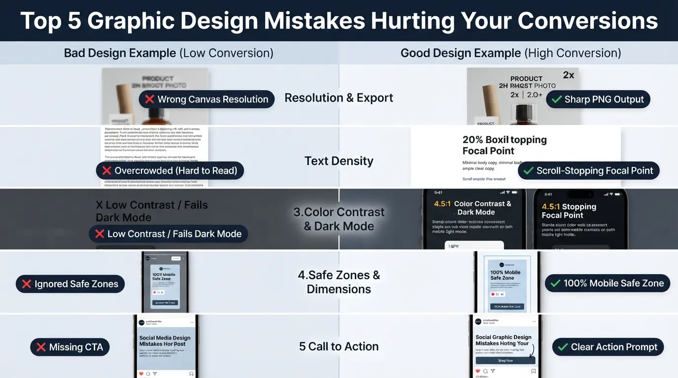
Even with visually appealing aesthetics, subtle technical or layout mistakes can severely diminish your click-through rates (CTR) and user engagement. Below are the five most common social media design errors you must avoid.
1. Blurriness and Pixelation Due to Incorrect Export Resolution
Uploading a design with sub-optimal resolution forces social media platforms to scale and compress your asset, resulting in pixelated visuals and blurry text.
The Fix: Always design on a 2x canvas size (e.g., 2160×2700 px for a 1080×1350 px feed post) before exporting. This ensures that when platform compression algorithms trigger, the visual maintains sharp text edges and clean lines.
2. Overcrowding Graphics with Too Much Text
Treating a social media graphic like a full blog post or promotional flyer overwhelms users who are quickly scrolling through their feeds. High text density significantly decreases post readability.
The Fix: Follow the 80/20 Visual Rule. Dedicate 80% of the graphic canvas to imagery, whitespace, and a high-impact headline. Reserve long-form explanations and detailed lists for the post caption or a secondary slide in a carousel.
3. Ignoring Dark Mode Users and Transparent PNG Fallbacks
Over 70% of smartphone users browse social media apps in Dark Mode. Graphic designs that rely on transparent backgrounds or ultra-dark outer borders often fail visually when viewed against dark UI interfaces.
The Fix: Avoid transparent backgrounds (
.png) for full-feed posts unless specifically needed. Always test logo graphics and icons against both solid light (#FFFFFF) and dark (#121212) background fills to ensure high contrast in all viewer environments.
4. Inconsistent Branding Across Different Platforms
Switching fonts, color palettes, or layout styles between Instagram, LinkedIn, and Facebook weakens brand identity and confuses potential buyers visiting your profile.
The Fix: Establish a centralized Brand Style Guide. Consistently use your primary brand colors (e.g., primary action red
#FF0000, neutral background#FFFFFF, and dark text#000000), uniform font families, and identical logo placement rules across all active channels.
5. Weak Visual Hierarchy and Missing Call to Action (CTA)
A design without a clear focal point leaves users unsure where to look first, while a post without an explicit visual Call to Action fails to convert interest into engagement.
The Fix: Direct user attention intentionally using contrast and size. End your graphics or final carousel slide with a clear, high-contrast CTA button or prompt (e.g., “Swipe to Learn More”, “Save This Checklist”, or “Visit Link in Bio”).
Downloadable & Embeddable Graphic Design Checklist
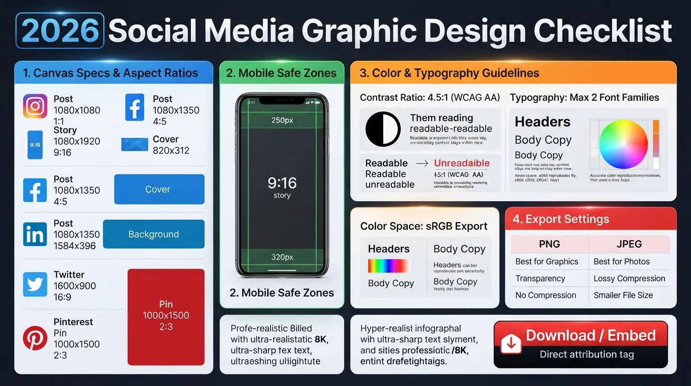
To help you keep these specifications handy while designing, we have condensed this entire guide into a high-resolution, quick-reference infographic cheat sheet.
You can save this visual checklist directly to your device or embed it onto your own blog or website for your team and readers.
2026 Social Media Graphic Specs Cheat Sheet
Free ResourceFrequently Asked Questions (FAQs)
Q. What is the best file format for social media graphics?
PNG is best for graphics containing text, vector illustrations, and logos to avoid compression artifacts, while JPEG works best for photo-heavy imagery to keep file sizes low.
Q. Why are my social media images blurry when uploaded?
Blurriness happens due to automatic platform compression when your file size is too large or the pixel resolution doesn't match platform specs. Always design on a 2x canvas scale (e.g., 2160 × 2700 px) and export in sRGB mode.
Q. What ratio works best for Instagram engagement in 2026?
The 4:5 vertical format (1080 × 1350 px) performs best. It takes up 33% more physical screen real estate on mobile devices compared to traditional square posts, keeping users engaged longer on your content.