

Mastering Graphic Design: A Beginner’s Roadmap
Look at any striking poster, sleek mobile app, or memorable brand logo, and it’s easy to feel overwhelmed. You might think, "I’m not creative enough for this," or assume you need years of art school and overly complex software just to create something decent.
Here’s the truth: graphic design isn’t an innate magical talent. It’s a learnable skill built on a few core principles, a bit of practice, and the right mindset.
You don't need to master every tool on day one to make visuals that look clean, professional, and purpose-driven.
In this beginner-friendly guide, we’re stripping away the confusing jargon and breaking down everything you need to know. From fundamental layout rules and typography basics to free tools like Canva and industry standards like Adobe Illustrator, you’ll discover the exact roadmap to go from complete novice to confident creator.
What is Graphic Design?

Strip away the complex jargon, and graphic design comes down to one core concept: it is the art and science of visual communication. At its heart, graphic design is about taking an idea, a message, or a problem, and solving it by turning it into a clear visual format. When you look at a sleek modern logo, a billboard on your daily commute, the packaging on your favorite snack, or even the layout of the app you're using right now—you are looking at graphic design in action.
Think of it as translating words and feelings into visual elements like typography (fonts), colors, imagery, and shapes.
Expert Insight
A common mistake beginners make is treating graphic design like pure art. Art is created to express emotion or evoke a feeling for its own sake. Design, on the other hand, always has a specific job to do—it has to inform, persuade, guide, or solve a problem for an audience.
To help you see the bigger picture, graphic design isn't just one single skill—it spans several distinct specialties.
Where Graphic Design Shows Up in the Real World
Here is a quick breakdown of where graphic design actually shows up in the real world:
- Brand Identity Design: Logos, brand color palettes, and brand guidelines that give a business its unique personality (e.g., Nike's iconic Swoosh).
- Digital & Social Media Design: Thumbnails, Instagram posts, web banners, and digital ads tailored to catch your eye on a screen.
- Print Design: Physical materials like business cards, posters, magazine layouts, brochures, and billboards.
- Packaging Design: The box, bottle, or wrapper that holds a product and makes it stand out on store shelves.
- UI/UX Design: User Interface (UI) design focuses on the visual look of websites and mobile apps, ensuring buttons, menus, and screens are easy to navigate.
Why Graphic Design Matters
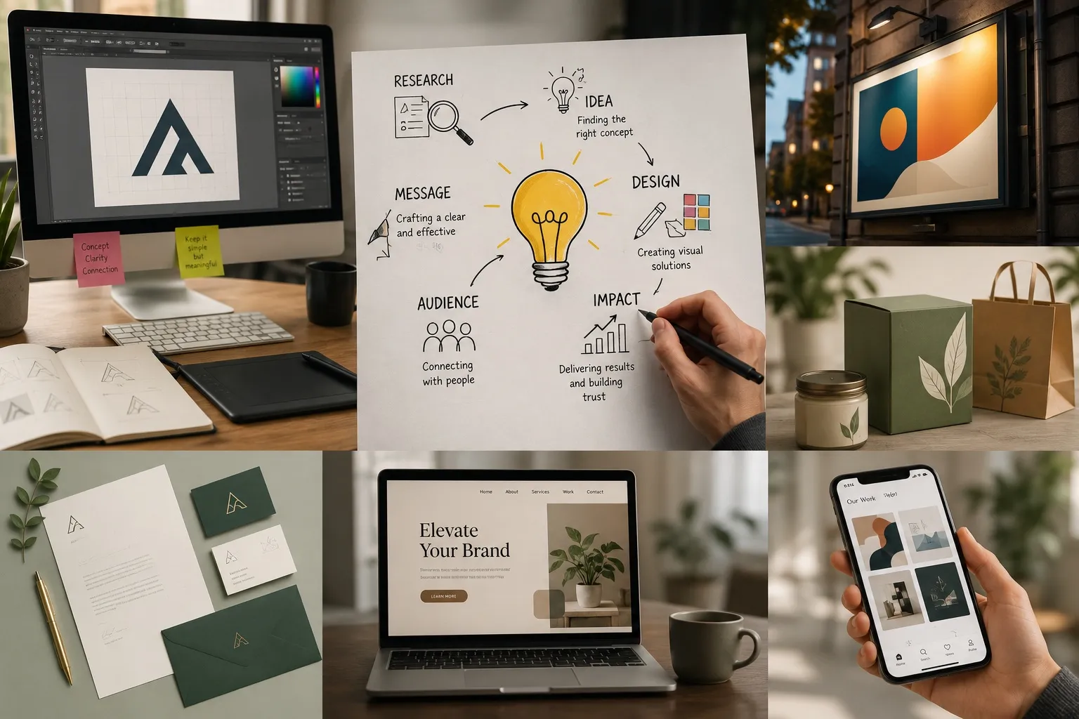
Graphic design is far more than just making things look pretty. At its core, it is visual problem-solving—a strategic bridge between a message and the audience receiving it.
Whether you are building a personal brand, running a local business, or launching a digital product, effective design dictates how your message is felt and remembered.
Why Graphic Design Plays a Crucial Role in Modern Communication
Creates an Instant First Impression
You only have about 50 milliseconds (0.05 seconds) for users to form an opinion about your visual content online. Before a single word of your copy is read, your layout, visual hierarchy, colors, and typography set the tone. A cluttered, mismatched graphic signals amateurism, while a balanced layout instantly invites curiosity.
Builds Brand Trust and Credibility
Consistency creates recognition, and recognition builds trust. Think of brands like Spotify or Apple. You can spot their graphics instantly—even without a logo present—because they maintain consistent color palettes, typography, and visual style. When your visual output looks professional, potential clients automatically associate that quality with your products or services.
Practical Experience Insight
A common mistake I see beginners make is treating design elements as isolated decisions. Changing fonts across every social media post or using five different accent colors dilutes your visual brand. Sticking to a simple visual style guide early on pays massive dividends in credibility.
Communicates Ideas Faster Than Text
The human brain processes visual information significantly faster than plain text. Good graphic design simplifies complex ideas into digestible visual assets:
- Infographics turn dense statistical reports into easy-to-read stories.
- Visual Hierarchy guides the viewer's eye straight to the Call-to-Action (CTA).
- Icons and Diagrams eliminate language barriers and cut down reading time.
When done right, design does not just decorate your words—it carries half the workload of your message.
Core Principles of Graphic Design
4. Core Principles of Graphic Design
To create visuals that are both functional and aesthetically pleasing, every design relies on seven foundational principles. Master these, and your work will instantly level up:
Contrast
Creates visual impact by placing opposing elements together (e.g., dark vs. light, large vs. small text). It makes important information pop and improves readability.
Alignment
Ensures every element has a visual connection to something else on the page. Proper alignment creates a clean, organized, and intentional layout.
Repetition
Reusing consistent elements like fonts, colors, or icons throughout a layout. Repetition ties your design together and creates brand unity.
Proximity
Grouping related items close together to show they belong together. It organizes information logically and declutters your layout.
Balance
Distributing visual weight across the canvas. Balance can be symmetrical (mirrored sides) or asymmetrical (balanced using elements of different sizes and contrast).
Hierarchy
Directing the viewer's eye to what matters most first. Using font sizes, weight, and placement ensures headlines lead, followed by subheadings and body text.
White Space
The empty space around design elements. White space isn't "wasted" space—it gives your design room to breathe and prevents visual overload.
5. Color Theory Basics
Color drives emotion and shapes perception before a reader even processes your words. Beginners often make the mistake of using too many colors at once, which overwhelms the viewer.
The 60-30-10 Beginner Rule
Keep your color choices simple and effective with a 3-color structure:
- 1 Main Color (60%): Your dominant base color, usually neutral or white for backgrounds.
- 1 Secondary Color (30%): A complementary tone for structural elements like cards, headers, or subtle borders.
- 1 Accent Color (10%): Reserve high-contrast, bold colors (like vibrant red or neon) exclusively for Call-to-Action (CTA) buttons and key highlights.
6. Typography Basics
Typography isn't just picking nice fonts—it's the art of arranging text to make written language legible, readable, and appealing when displayed.
Font Pairing Rules
A good rule of thumb is never to use more than two complementary fonts in a single design. Combine a strong, clean header font (like a bold Sans-Serif) with a highly readable body font (like a standard Serif or neutral Sans-Serif).
Readability & Visual Hierarchy
Keep your text scannable. Your main title (H1) should be the largest element, followed by subheadings (H2/H3), and body text at a comfortable reading size (16px–18px on screens). Ensure line height (leading) has enough breathing room so lines don't bleed into each other.